Major Overhaul to Gameplay and Visuals in Dark Discard
A New Chapter Begins
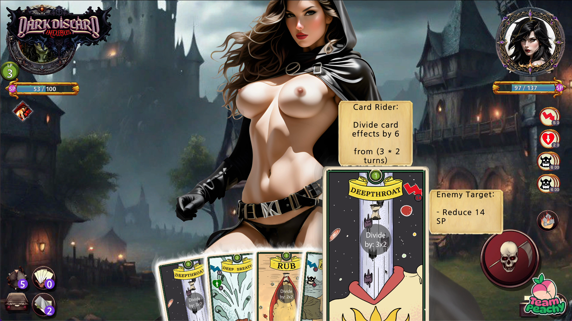
We are thrilled to share some exciting developments that will significantly enhance the experience of playing Dark Discard. As we continuously strive to blend card play and sex, our latest updates focus on overhauling the game flow and visual presentation to offer something highly playable and visually engaging.
Gameplay Evolution: Continuous Exploration
One of the most significant changes you’ll notice is the update to the game’s flow, introducing a dynamic exploration aspect within the miasma. This new system replaces the linear progression of encounters with a choice-driven approach, allowing you to select your next step from a set of choices.
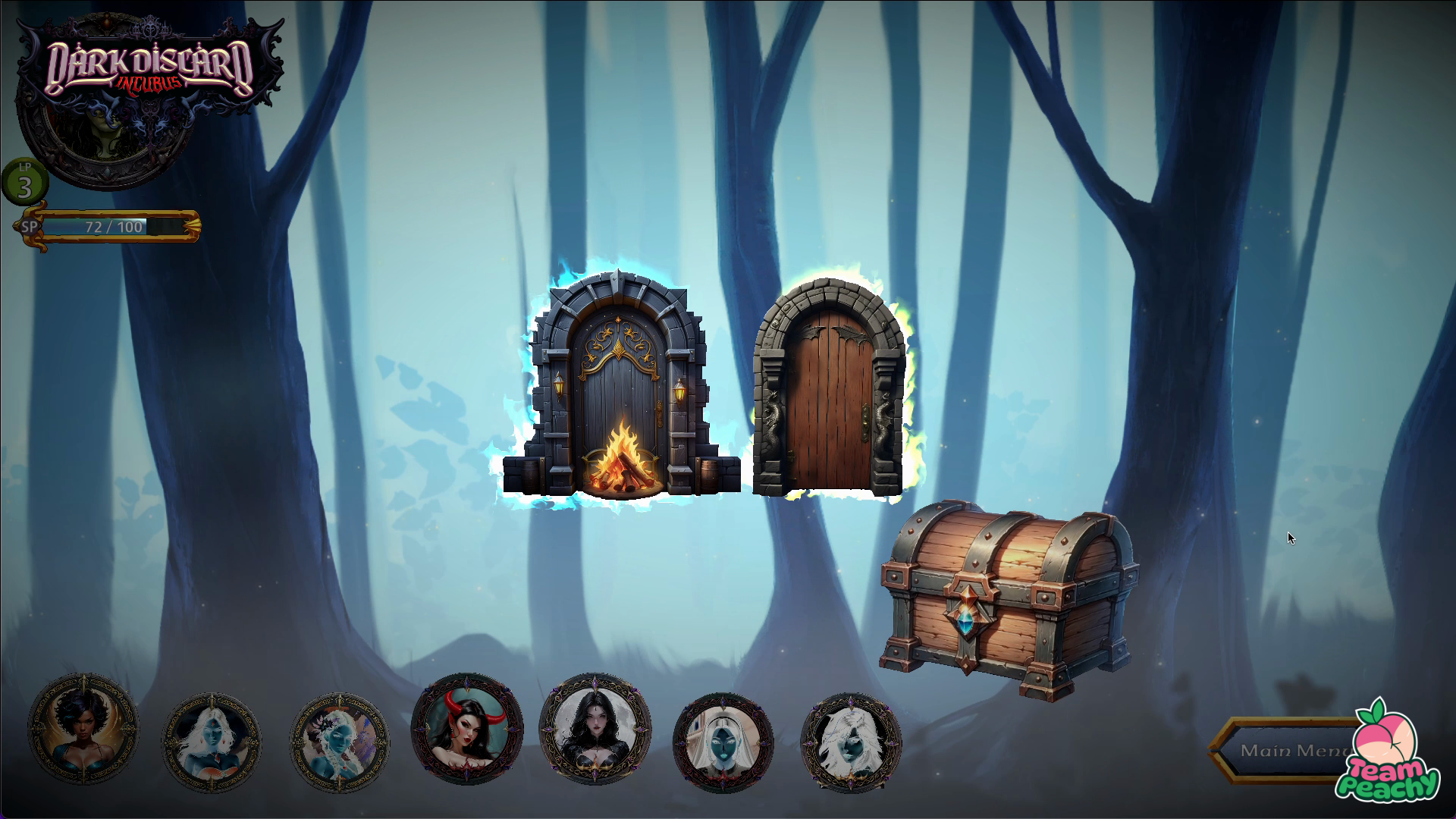
Encounters with opponents are concealed behind mysterious doors within a 3d landscape. This change aims to immerse you deeper into the dark fantasy world we are crafting, providing a sense of unpredictability and excitement between encounters. We are introducing risk and reward decisions with chests and rest points that offer opportunities to gain new cards, recover SP (stamina points), and gain unique aspects that can aid you in your journey.
These updates are designed to enrich the strategic depth of “Dark Discard,” providing a more robust and varied gameplay experience that keeps the game fresh through every playthrough.

Visuals Overhaul: Taking a Bold Step Forward
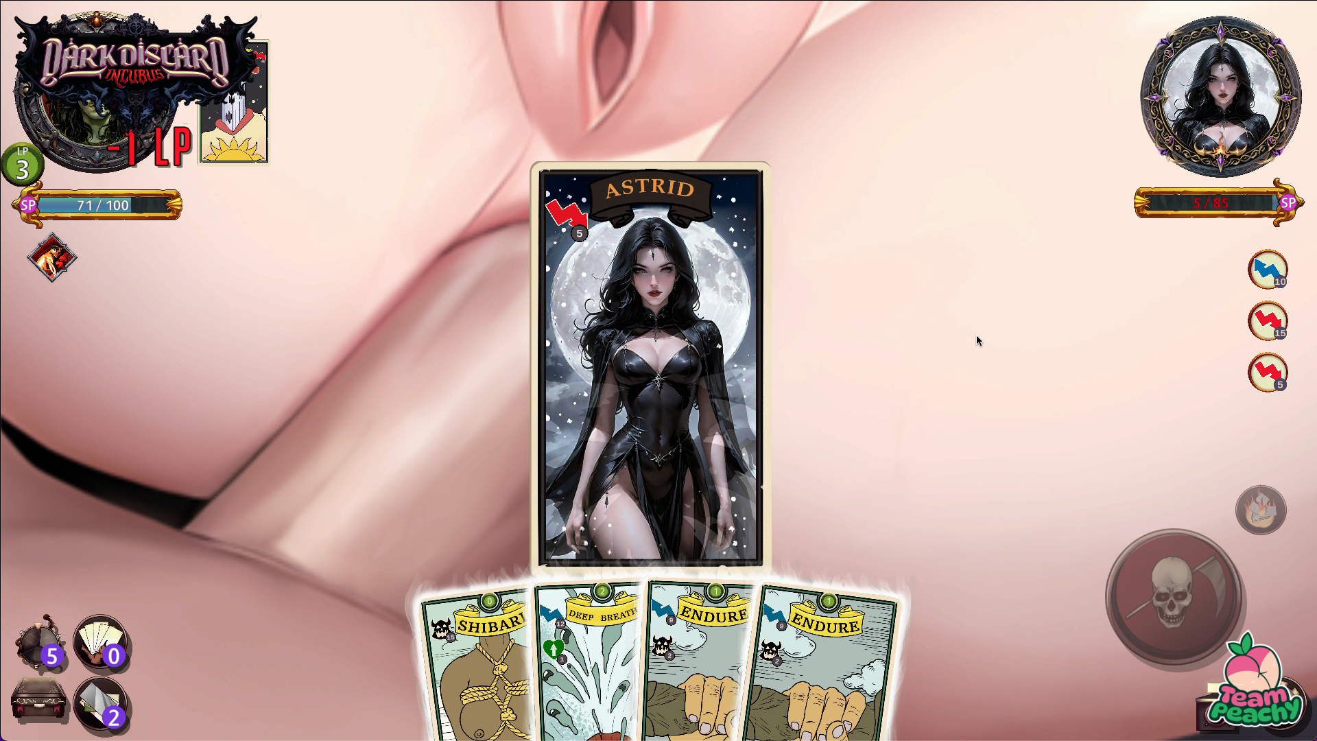
In our quest to offer an exceptional experience, we’re undertaking a massive overhaul of the game’s visual content. The art will become much more explicit, especially during the resolve phase of encounters, which will now include up-close shots of explicit sex. This decision was a no-brainer, enhancing the game’s sexual appeal and better aligning with our vision for Dark Discard.
We want to have more characters for you to play with and faster. To accomplish this, we are now fully leveraging AI to create our character concepts. Our small team will now be able to produce a vast array of diverse and detailed characters significantly faster. We will meticulously edit and animate the AI-generated concepts, ensuring each character remains unique while fitting seamlessly into a single art style.
Looking Forward
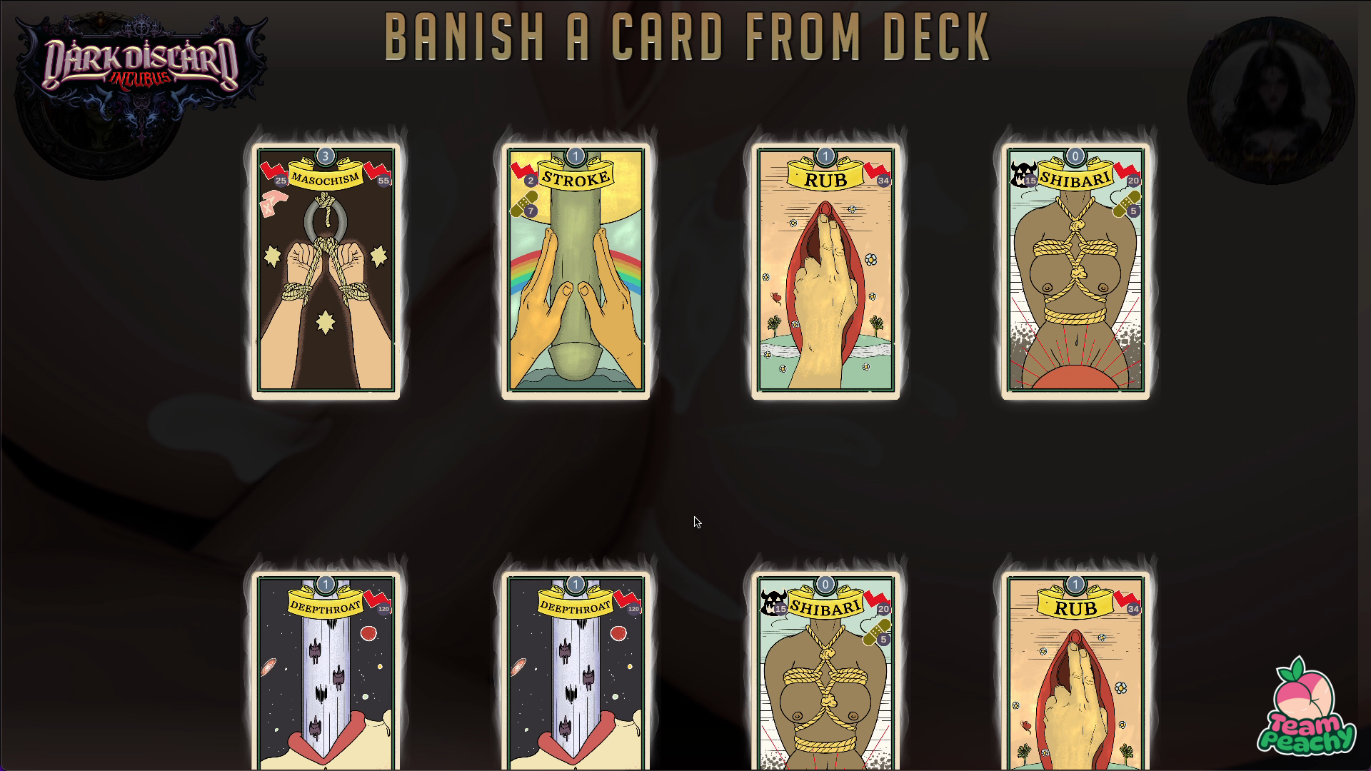
These updates mark a significant milestone in Dark Discard’s evolution. By enhancing the gameplay depth, flooding encounters with heavy amounts of lewd, and taking bold steps in our visual presentation, we can offer an experience that is fun, sexy, and artistically compelling.
We’re incredibly excited about this new chapter and can’t wait for you to experience the updates first-hand. As always, we value your feedback and support. Stay tuned for more updates!
Team Peachy

Files
Get Dark Discard (18+) (WIP)
Dark Discard (18+) (WIP)
NSFW deckbuilding card battle game
| Status | In development |
| Author | Team Peachy |
| Genre | Card Game, Adventure |
| Tags | 2D, Adult, Dark, Deck Building, Erotic, Fantasy, sexy, Singleplayer |
| Languages | English |
More posts
- Dark Discard v0.52.473 days ago
- Overcoming Challenges in Creating a Dynamic 2D Character System in Spine & UnityApr 01, 2025
- Dark Discard v0.50.3Jan 29, 2025
- Dark Discard v 0.50.1 Dynamic OpponentsDec 30, 2024
- Dark Discard v0.49.8 UpdateNov 23, 2024
- Dark Discard v0.48.9Oct 27, 2024
- October Release coming soonOct 24, 2024
- Update v38.3Jan 26, 2024

Comments
Log in with itch.io to leave a comment.
I've been looking for a game that blends the gameplay of a card battler with sex, and this would be it, but the AI art is not the way to go. I would personally pay for the game, if it had a real artist behind it. A good strategy might be to keep the AI art as placeholder art (clearly mark it as such, so you don't forget), then incorporate the final art near the end.
Yes! We changed up and started making real art and animation again. We’ll have more to show soon. Thanks for the feedback.
That looks good! You should use such an animiation as screenshot #1 or #2. Those get shown when hovering the game in the browse section.
And here I was, wondering why your screenshots looked nothing like the game I just tried. The new "art" looks bad. There is nothing to sugercoat. It is same as you see in all those shovelware AI adult games. Yawn.
You might want to reconsider that change. If you did it to make the game look better, it failed. Tbh, with the new screenshots I probably would not even have tried the game. And I am not even an AI hater. It just looks bland and boring. People do not go looking for games because they have AI art, but some avoid them because of it. You have actual game play, AI art does not enhance your game, it degrades it.
At first I thought, after playing the game and looking at the 2d art again, aha, the dev is replacing the placeholder AI pics with real art...
The card game has some interesting mechanics. Plays too slow. Needs a speedup setting. It is like playing Monster Train on normal speed. Card animations look only nice for five minutes. Some of those upgrades are actually bad and you cannot refuse them. Like discard instead of expend. I cannot say I fully grasped the expend mechanic. But when I discard my 7 cost card, I do not get the 7 points to fuel the two mimics with the maso to one shot most enemies. Same with the upgrade to have a card cost 0. That is not really helping. The current game mechanics punish you for playing cards, so you only ever play your best cards. Also, too much text clicking. And your door mechanic and those chests and whatnot could use some tooltips to explain what is going on.
Thanks for this honest feedback, it is a wake up call.
We are a smaller team than when we started, and the push for AI was to be able to continue with the project having lost really talented artists. The results don’t compare and the overall quality has suffered.
Our next step has to be a serious look at how to go back to real artwork given important constraints of time and resources.
Having no longer access to more artwork from the same source would be a reason to change the art. I was just lamenting because it read like you did it for other reasons.
I look at lots of nsfw games and comments and the impression I got was, that AI is not really popular. It is tolerated, not something to brag about. Pixel art would be a counterexample. People highlight it and advertise with it.
And the timing was just too weird. I downloaded a version with AI art, while the screenshots were still the old ones. And after playing a bit, I checked back with the page and wondered why I never got to the part with the screenshots. When I reloaded the page, you had changed the screenshots and made this devlog.